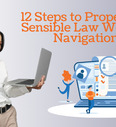
Creating mobile-friendly content for your law website is crucial in today’s digital lawyer marketing landscape, as an increasing number of users access the world wide web through their mobile devices. To ensure a seamless user experience and maximize engagement on mobile platforms, consider the following advice:

1. Responsive Design
Opt for a responsive website design that adapts to different screen sizes and resolutions. This approach will ensure your content is displayed appropriately on various mobile devices, including smartphones and tablets.
2. Streamlined Navigation
Simplify your website’s navigation menu to accommodate smaller screens. Use a concise and intuitive menu structure, employing dropdowns or hamburger menus when necessary. Ensure essential sections, such as practice areas, contact information, and blog articles, are easily accessible.
3. Clear and Concise Content
Mobile users tend to skim rather than read lengthy paragraphs. Optimize your content by using short, concise sentences and paragraphs. Utilize headings, bullet points, and subheadings to break up text and enhance readability.
4. Readable Fonts
Choose fonts that are legible on small screens. Avoid using overly decorative or complex fonts. Opt for a font size of at least 14 pixels to ensure comfortable reading without zooming in.
5. Engaging Headlines and Subheadings
Craft compelling headlines and subheadings that capture attention and convey your content’s purpose. Use them strategically to guide users through your content and highlight critical information.
6. Visual Elements
Incorporate visuals to enhance the user experience. Use high-quality images, videos, infographics, and charts to convey information effectively. Optimize these elements for quick loading times to avoid frustrating users.
7. Optimize Load Times
Mobile users expect fast-loading websites. Optimize your website by compressing images, minimizing code, and leveraging browser caching. This will improve load times, reducing the risk of users abandoning your site.
8. Mobile-Friendly Forms
If you have contact forms or other interactive elements, ensure they are mobile-friendly. Use responsive form designs and provide clear instructions to facilitate user input on smaller screens.
9. Location-Based Information
If your law firm has multiple office locations, consider incorporating geolocation features. This allows users to find the nearest office easily and obtain relevant contact information.
10. Test and Optimize
Regularly test your website on various mobile devices and screen sizes to ensure consistent functionality and usability. Monitor user behavior using analytics tools to identify areas for improvement and make data-driven decisions.
11. Voice Search Optimization
With the rise of voice assistants, optimize your content for voice searches. Focus on natural language as well as long-tail keywords to effectively match users’ voice queries.
12. Mobile-Friendly SEO
Implement mobile-friendly search engine optimization (SEO) techniques to improve your website’s visibility in mobile search results. This includes optimizing meta tags, titles, and headers and incorporating relevant keywords.
13. Social Sharing
Make it easy for users to share your content across social media platforms by including social sharing buttons. Mobile users are more likely to share content if the process is streamlined and convenient.
14. Mobile-Friendly Test
Use Google’s Mobile-Friendly Test tool to ensure your website meets mobile optimization standards. This tool provides insights into any issues hindering your website’s mobile performance.
15. Accessibility
Ensure your website is accessible to users with disabilities. Follow web accessibility guidelines, such as adding alt text to images and providing video captions, to ensure an inclusive user experience.
Conclusion
By implementing these mobile-friendly lawyer marketing strategies, you can enhance user experience, increase engagement, and maximize the reach of your law website across mobile devices. Regularly monitor and adapt your website based on user feedback and emerging trends to stay ahead in the mobile-first digital landscape.
Read the related article here: https://www.victorylawyermarketing.com/10-avoidable-seo-mistakes-in-your-lawyer-website/